Home
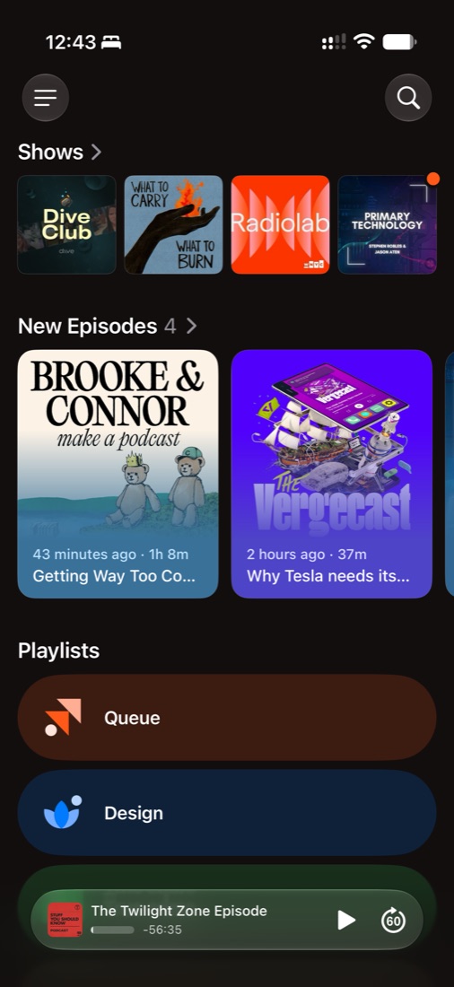
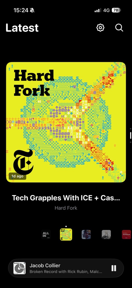
Home used to be “Latest”: one giant episode at a time, swiping through everything new. Beautiful, but with no overview and no end. Now it takes one look instead of a swipe per episode: your shows, how many episodes are new, and your playlists, with the Queue first.
What I gave up
- The immersive, artwork-first browse. “Latest” felt like flipping through records, and some people enjoy discovering that way.
- A podcast app gets opened with a job in mind: what’s new, what’s next. Answering that in one look beats a beautiful swipe through everything.
- Artwork still leads: shows are a row of covers, and new episodes are large, artwork-led cards.
- Listeners asking for a way to browse back through everything new. That would mean the Inbox isn’t enough of a place to explore.